The Spirits Business Design & Packaging Masters were announced earlier this week and we were delighted to have been awarded the top-performing award of Masterfor our Ben Lomond Gin packaging.
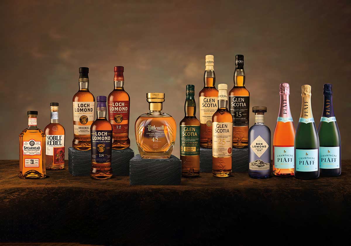
Our London Dry Style gin was launched last year and the bottle design was developed to represent the area that inspired the gin, the area that Ben Lomond overlooks; Loch Lomond & The Trossachs. We wanted the bottle to embody all the physical elements that we felt inspired its creation.
The heavy, tall, majestic bottle was chosen to represent the feel of the mountain, the wooden stopper represents the nature of the Trossachs, the colour represents both the blue of the loch and the purple of the heather. The mountain was placed on the label to pay homage to our namesake, and to showcase the element that overlooks the whole area that our inspiration came from. The trig point was added for the same reason, to give people a physical connection to our area and to inspire the feeling of exploration and adventure. Finally we put Scottish Gin on the main label to hero our provenance and our pride in being Scottish-made.
The awards are judged by a panel of experts in packaging design and the main aim is to assess each entry based on its aesthetics, functionality, sustainability and overall quality. Bryan Rodriguez, wine and spirits buyer for Harvey Nichols noted "Ben Lomond has a good‐looking blue glass bottle and big proud wooden stopper" and further commented, "I like the GPS coordinates adding a bit of adventure to it". The judges further commented on the overall competition, stating that it was evident that a great deal of care is being given to brand packaging.
We've always been inspired by our gin packaging and are very pleased to see others are too!

